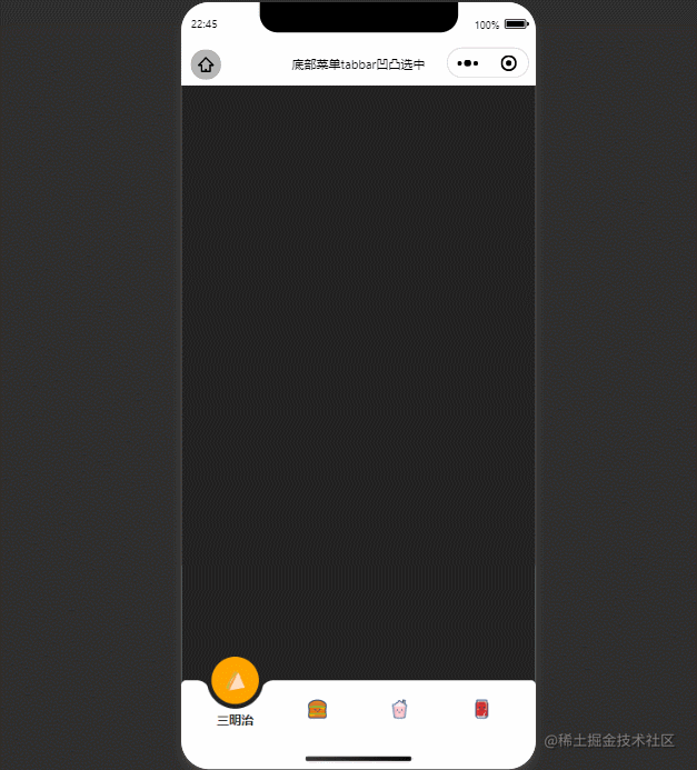
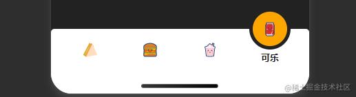
1.实现效果
2.实现原理
2.1 引入阿里巴巴矢量图标
可参考文章:微信小程序引入外部icon(阿里巴巴矢量图标)[1]^{[1]}[1]
2.2 css函数var
css的var函数[2]^{[2]}[2]:var() 函数用于插入自定义的属性值,如果一个属性值在多处被使用,该方法就很有用。
语法:
var(custom-property-name, value)
| 值 | 描述 |
|---|---|
| custom-property-name | 必需。自定义属性的名称,必需以 -- 开头。 |
| value | 可选。备用值,在属性不存在的时候使用。 |
eg:
page {
  --color: #222;
  background: var(--color);
  --bg: orange;
  --w: 175rpx;
}
2.3 ios底部安全距离
苹果官方推荐:使用env(),constant()来进行底部安全距离适配。
iOS11 新增特性,Webkit 的一个 CSS 函数,用于设定安全区域与边界的距离,有四个预定义的变量: safe-area-inset-left:安全区域距离左边边界的距离 safe-area-inset-right:安全区域距离右边边界的距离 safe-area-inset-top:安全区域距离顶部边界的距离 safe-area-inset-bottom :安全距离底部边界的距离 一般情况下,关注safe-area-inset-bottom即可。
使用前提:
- 网页需设置viewport-fit=cover,小程序总默认为viewport-fit=cover
- IOS11.2之前使用constant()函数,IOS11.2之后使用env()
- env()和constant()需要同时存在,并且constant()在前,顺序不能改变
2.4 css属性transition
CSS3 transition 属性[3]^{[3]}[3]:transition 属性设置元素当过渡效果。注:始终指定transition-duration属性,否则持续时间为0,transition不会有任何效果。
语法:
transition: property duration timing-function delay;
| 值 | 描述 |
|---|---|
| transition-property | 指定CSS属性的name,transition效果 |
| transition-duration | transition效果需要指定多少秒或毫秒才能完成 |
| transition-timing-function | 指定transition效果的转速曲线 |
| transition-delay | 定义transition效果开始的时候 |
2.5 box-shadow
CSS3 box-shadow 属性[4]^{[4]}[4]:可以设置一个或多个下拉阴影的框。 boxShadow 属性把一个或多个下拉阴影添加到框上。该属性是一个用逗号分隔阴影的列表,每个阴影由 2-4 个长度值、一个可选的颜色值和一个可选的 inset 关键字来规定。省略长度的值是 0。
语法:
box-shadow: h-shadow v-shadow blur spread color inset;
| 值 | 说明 |
|---|---|
| h-shadow | 必需的。水平阴影的位置。允许负值 |
| v-shadow | 必需的。垂直阴影的位置。允许负值 |
| blur | 可选。模糊距离 |
| spread | 可选。阴影的大小 |
| color | 可选。阴影的颜色。在CSS颜色值寻找颜色值的完整列表 |
| inset | 可选。从外层的阴影(开始时)改变阴影内侧阴影 |
2.6 border-radius
CSS3 border-radius 属性:[5]^{[5]}[5]border-radius 允许你设置元素的外边框圆角。当使用一个半径时确定一个圆形,当使用两个半径时确定一个椭圆。这个(椭)圆与边框的交集形成圆角效果。
语法
border-radius: 1-4 length|% / 1-4 length|%;
注:每个半径的四个值的顺序是:左上角,右上角,右下角,左下角。如果省略左下角,右上角是相同的。如果省略右下角,左上角是相同的。如果省略右上角,左上角是相同的。
eg:
view{
  margin: 50px auto;
  border-radius: 15rpx 50rpx;
  width: 200rpx;
  height: 100rpx;
  border: 1px solid orange;
}
3.实现步骤
3.1 实现底部tabbar
- flex横向布局并居中,实现4个tabbar,fixed定位居于底部,并设置ios底部安全距离
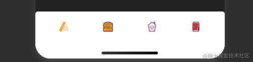
- 设置currIndex参数,表示当前选中tabbar的索引,currIndex==index设置激活样式
- 为当前选中的tabbar添加选中背景,背景基于整个底部栏设置absolute定位,根据tabbar宽,背景度,页面总宽得出定位left偏移距离,top设置为底部栏高度的-50%
- left偏移距离的计算:
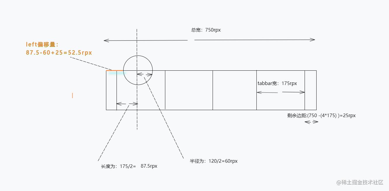
- 使用var函数计算:
page {
  --w: 175rpx;//tabbar宽度
  --t: 750rpx;//总宽度
  --c: 120rpx;//选中背景宽度
  /* 注意:env()和constant()需要同时存在,且constant()在前 */
  padding-bottom: calc(constant(safe-area-inset-bottom)  140rpx);
  padding-bottom: calc(env(safe-area-inset-bottom)   140rpx);
}
-left-pad: calc(var(--t) - (4 * var(--w))); left: calc((var(--left-pad) / 2) (var(--w) / 2) - (var(--c) / 2));
- topt偏移距离的计算: top设置为底部栏高度的-50%,需要配合ios底部安全距离使用,即:
  top: calc(-50%   constant(safe-area-inset-bottom) / 2);
  top: calc(-50%   env(safe-area-inset-bottom) / 2);
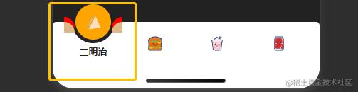
- 当选中的currIndex变化,tabbar背景设置transform偏移
  transform: translateX(calc(var(--w) * var(--n)));
  //--w:tabbar宽度,--n对应currIndex
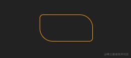
3.2 tabbar背景凹凸圆角
- 伪元素 box-shadow实现凹凸圆角
- 修改伪元素背景颜色为transparent,设置box-shadow设置与页面整体背景一致
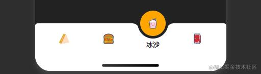
.active-tabbar-box::before,
.active-tabbar-box::after {
  content: "";
  position: absolute;
  top: 50%;
  width: 30rpx;
  height: 30rpx;
  background: transparent;
}
.active-tabbar-box::before {
  left: -33rpx;
  border-radius: 0 30rpx 0 0;
  box-shadow: 0 -15rpx 0 0 var(--color);
}
.active-tabbar-box::after {
  right: -33rpx;
  border-radius: 30rpx 0 0 0;
  box-shadow: 0 -15rpx 0 0 var(--color);
}
4.实现代码
<view class="tabbar-box">
  <block wx:for="{{menu}}" wx:key="list">
    <view class="menu-item {{currIndex==index && 'active'}}" catchtap="tabClick" data-index="{{index}}">
      <view class="iconfont {{item.icon}}"></view>
      <text>{{item.name}}</text>
    </view>
  </block>
  <view class="active-tabbar-box" style="--n:{{currIndex}}"></view>
</view>
Page({
data: {
currIndex: 0,
menu: [{
name: "三明治",
icon: "icon-susua-2-53"
},
{
name: "汉堡",
icon: "icon-susuhanbao"
},
{
name: "冰沙",
icon: "icon-susubingsha"
},
{
name: "可乐",
icon: "icon-susukele"
},
]
},
tabClick(e) {
let {
index
} = e.currentTarget.dataset;
this.setData({
currIndex: index,
})
},
})@import "../utils/icon-font.wxss";
page {
--color: #222;
background: var(--color);
--bg: orange;
--w: 175rpx;
--t: 750rpx;
--c: 120rpx;
/* 注意:env()和constant()需要同时存在,且constant()在前 */
padding-bottom: calc(constant(safe-area-inset-bottom) 140rpx);
padding-bottom: calc(env(safe-area-inset-bottom) 140rpx);
}
.tabbar-box {
background: #fff;
border-radius: 10rpx 10rpx 0 0;
position: relative;
height: 120rpx;
width: var(--t);
display: flex;
align-items: center;
justify-content: center;
position: fixed;
left: 0;
bottom: 0;
z-index: 10;
padding-bottom: constant(safe-area-inset-bottom);
padding-bottom: env(safe-area-inset-bottom);
}
.menu-item {
display: flex;
align-items: center;
justify-content: center;
flex-direction: column;
width: var(--w);
height: 100%;
-webkit-tap-highlight-color: rgba(0, 0, 0, 0);
}
.menu-item .iconfont {
font-size: 40rpx;
color: var(--color);
transition: 0.5s all;
position: relative;
z-index: 9;
}
.menu-item text {
position: absolute;
font-size: 26rpx;
font-weight: bold;
color: #222;
transition: 0.5s all;
opacity: 0;
transform: translateY(50rpx);
}
.menu-item.active .iconfont {
transform: translateY(-60rpx);
}
.menu-item.active text {
opacity: 1;
transform: translateY(22rpx);
}
.active-tabbar-box {
box-sizing: border-box;
position: absolute;
width: var(--c);
height: var(--c);
background: var(--bg);
--left-pad: calc(var(--t) - (4 * var(--w)));
left: calc((var(--left-pad) / 2) (var(--w) / 2) - (var(--c) / 2));
top: calc(-50% constant(safe-area-inset-bottom) / 2);
top: calc(-50% env(safe-area-inset-bottom) / 2);
border-radius: 50%;
border: 10rpx solid var(--color);
transition: 0.5s all;
}
.active-tabbar-box::before,
.active-tabbar-box::after {
content: "";
position: absolute;
top: 50%;
width: 30rpx;
height: 30rpx;
background: transparent;
}
.active-tabbar-box::before {
left: -33rpx;
border-radius: 0 30rpx 0 0;
box-shadow: 0 -15rpx 0 0 var(--color);
}
.active-tabbar-box::after {
right: -33rpx;
border-radius: 30rpx 0 0 0;
box-shadow: 0 -15rpx 0 0 var(--color);
}
.active-tabbar-box {
transform: translateX(calc(var(--w) * var(--n)));
}参考链接:
[1].微信小程序引入外部icon(阿里巴巴矢量图标)
[2].CSS的var函数
[3].CSS3 transition 属性
[4].CSS3 box-shadow 属性
[5].CSS3 border-radius 属性
总结
到此这篇关于微信小程序实现tabbar凹凸圆选中动画效果的文章就介绍到这了,更多相关小程序tabbar凹凸圆选中动画内容请搜索Devmax以前的文章或继续浏览下面的相关文章希望大家以后多多支持Devmax!